Viewing Data in Tamr Core
Tamr Core displays data in tabular format. You can resequence and hide columns, sort records, and select one or multiple records.
Configuring Column Order
To configure column order:
- Select Configure Table
 below the table.
 - Use the attribute's Handle
 to drag it to a different position in the order.
OR
Choose Send to top or Send to bottom
  to the right of the attribute name.
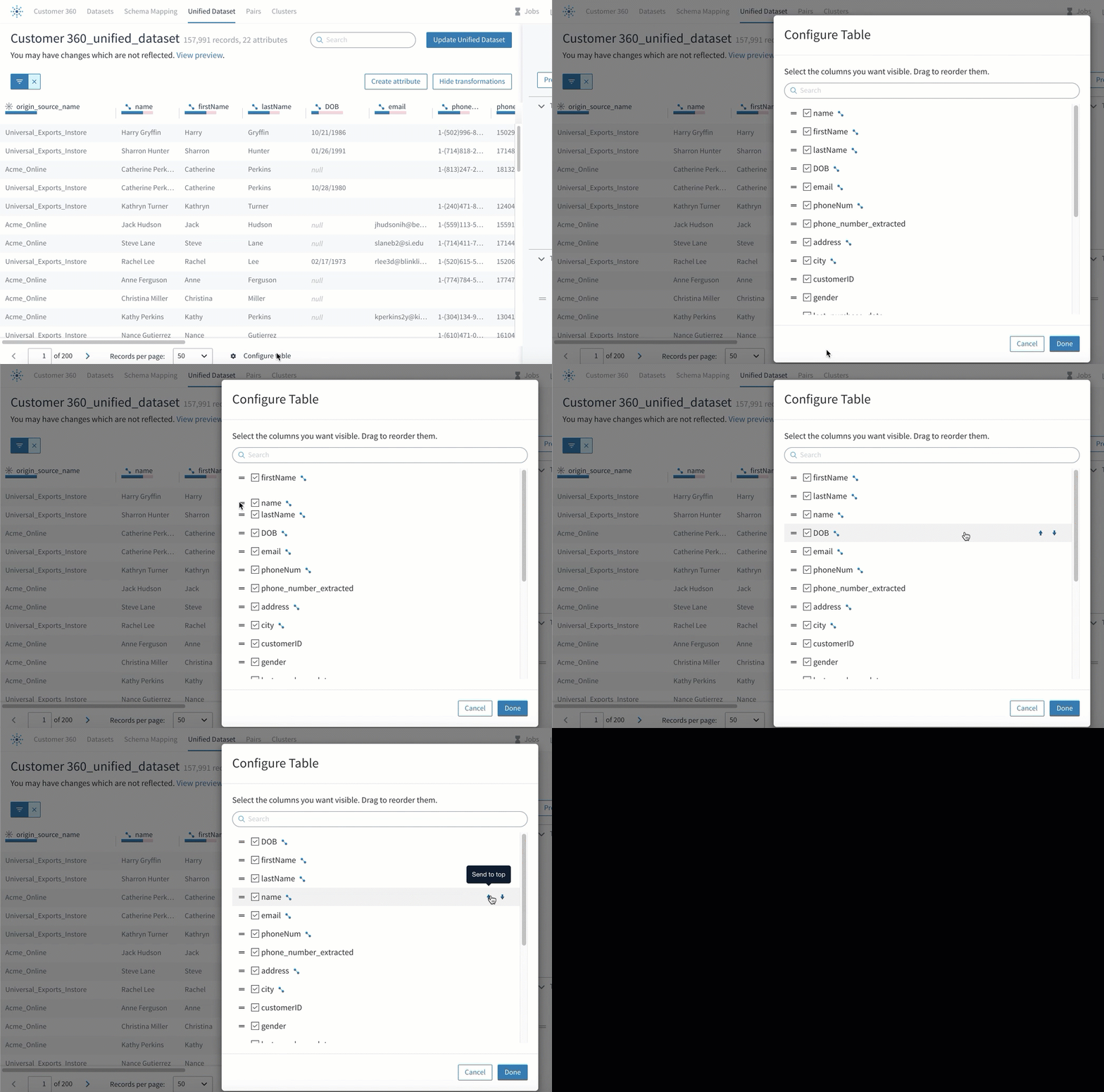
Modifying the order of attributes.
Configuring Column Visibility
To configure column visibility:
- Select Configure Table
 below the table.
 - Select or clear the checkboxes for each attribute to indicate which are visible or hidden, respectively.
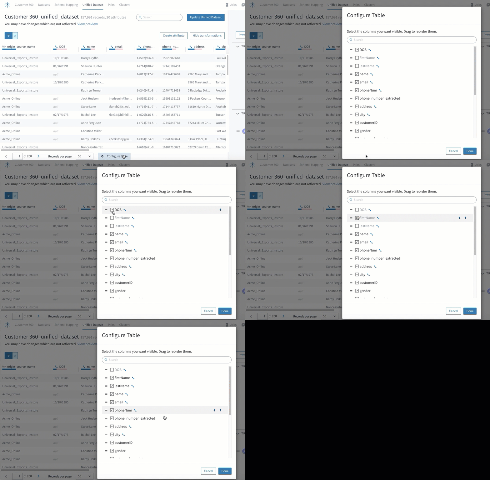
Including and removing attributes from view.
Changing Column Width
To change the width of a column:
- Move your cursor over the separator line between columns.
- Drag to resize the column, then release.
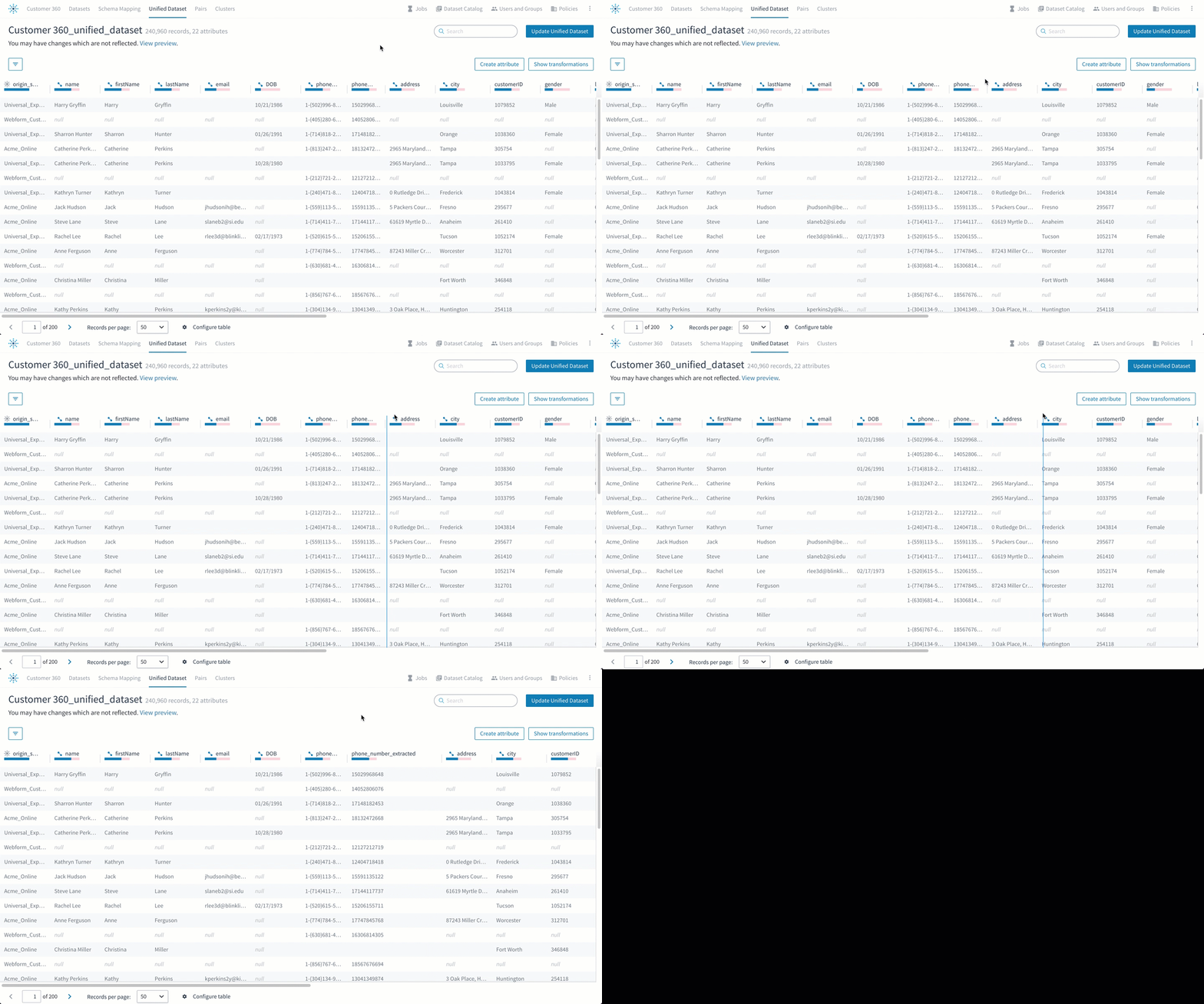
Dragging the column separator with your cursor.
Sorting by Attribute Value
To sort records or record pairs by attribute value:
Select the column name multiple times to cycle between ascending, descending, and unsorted.
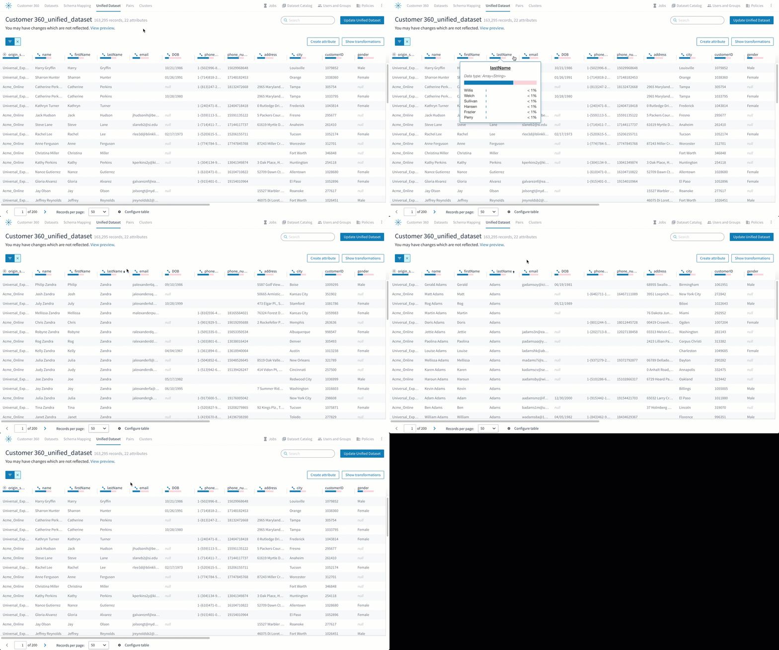
Sorting a column by selecting the column name.
Selecting Multiple Records or Record Pairs
To select multiple neighboring rows:
- Select the checkbox of the first record.
- Shift+Select the last record.
To select multiple non-neighboring rows:
If a checkbox appears when you move your cursor over the left end of a row, select the checkbox of each record. Alternatively, you can Ctrl+Select (Windows) or Cmd+Select (Mac) each record.
Icons in Column Headers
When Tamr Core displays data in tabular format, icons appear next to the attribute names to provide information about the source or use of that attribute.
![]() machine learning: Select or deselect this icon to include or not include an attribute in machine learning. The icon is blue when the attribute is included and white when it is not.
machine learning: Select or deselect this icon to include or not include an attribute in machine learning. The icon is blue when the attribute is included and white when it is not.
![]() system-generated: This attribute is generated by Tamr Core.
system-generated: This attribute is generated by Tamr Core.
![]() user-defined signal: This column reflects a user-defined signal. (Applies to the Pairs page in mastering projects only.)
user-defined signal: This column reflects a user-defined signal. (Applies to the Pairs page in mastering projects only.)
Interpreting Graphs in Column Headers
On the Schema Mapping and Unified Dataset pages, Tamr Core displays attribute density graphs under each attribute name.
Move your cursor over column headers for additional insight on each attribute value. The attribute density graph shows an estimated count of how many records in your dataset(s) contain single values, multiple values, or empty values for that attribute field.
The colors of the attribute density graph represent the following for each attribute:
- Blue: percentage of records with single values.
- Green: percentage of records with an array (multiple values).
- Pink: percentage of records with empty (null) values.
Note: The graph shows an approximate estimation of your data, meaning the percentages may not add up perfectly to 100%.
Attribute density graphs on the Schema Mapping page:
When you expand an attribute's details on the Schema Mapping page, the following information displays:
- Record count.
- Most frequent values with percentages.
- An attribute density graph representing the percentages of records with different types of data values versus those that are null, empty, or blank. Move your cursor over the colored sections of the bar to see the estimated, calculated percentages.
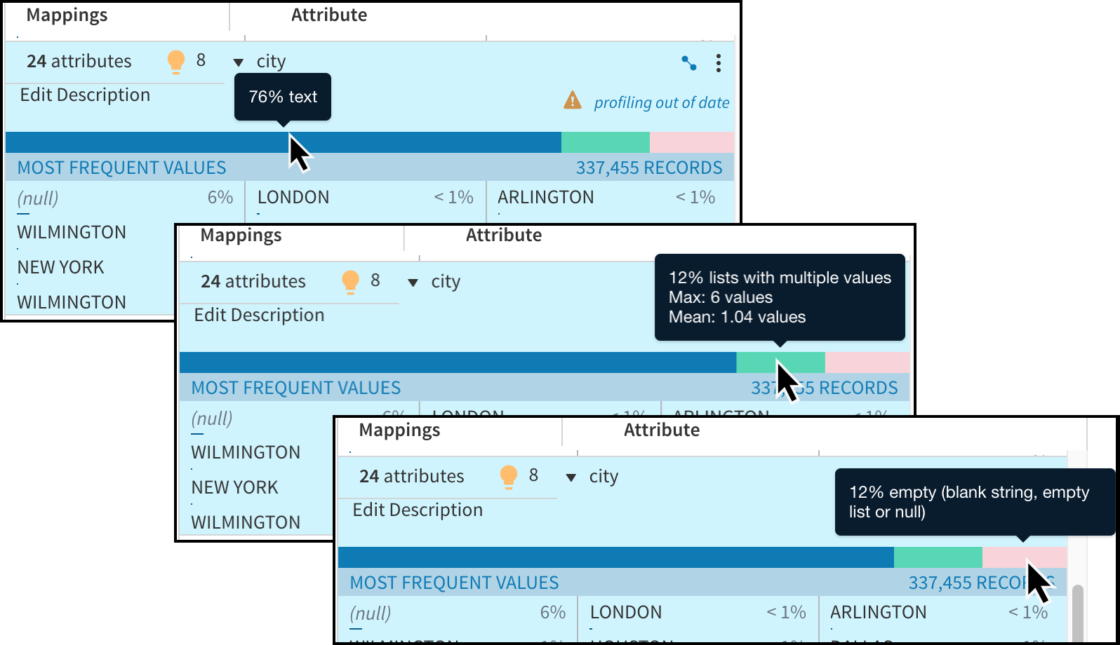
Records for this city attribute are 76% single values, 12% lists with multiple values (with a maximum of 6 and a mean of 1.04) and 12% empty (null, blank string, or empty list).
Attribute density graphs on the Unified Dataset page:
You can also access metrics on the Unified Dataset page. Move your cursor over the graph under an attribute name to see its metrics.
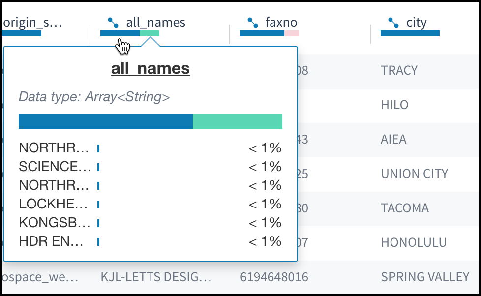
Viewing profiled data on the Unified Dataset page.
Opening a URL in Record Data
If a record contains a URL, you can open it in a new web browser tab.
Tamr Core displays any data value that begins with http or https followed by a well-formed URL as a selectable hyperlink.
To open a URL contained in a record's data:
- Navigate to any page displaying record data, such as the Unified Dataset, Pairs, Clusters, or categorized records page. If a record contains a URL, New tab
 appears inline with the selectable hyperlink highlighted in blue.
 - Choose New tab
 or the hyperlink.
Updated over 2 years ago